ABOUT LORE
6. Semester / UX 2
Podcasts have become a very popular medium for knowledge absorption due to their diversity, accessibility and flexibility. Because the medium is purely audio-based, listeners can engage in other activities while listening. But this causes a problem - when you hear something interesting you want to note, you are often not able to. Maybe because you are driving, cooking or doing sports - so you can't note the quote or timestamp down to remember it and probably you will forget it sooner or later. This was the initial problem we started off this project with.

Research
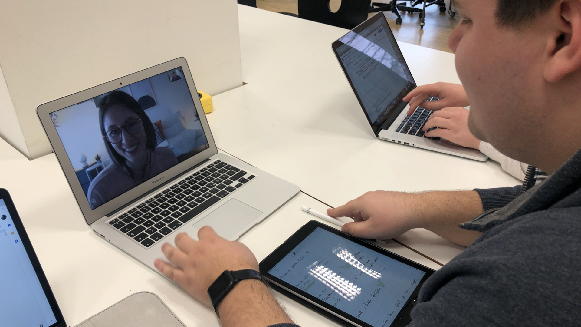
We kicked off this project with a Design Sprint. Therefore we needed quick research results to get a good understanding of the needs and problems of Podcast listeners. So we interviewed 12 people in less than 24 hours. About 50% of these interviews were remote via Skype. There we learned a lot about their listening behaviours and how they select what to hear.

Learnings
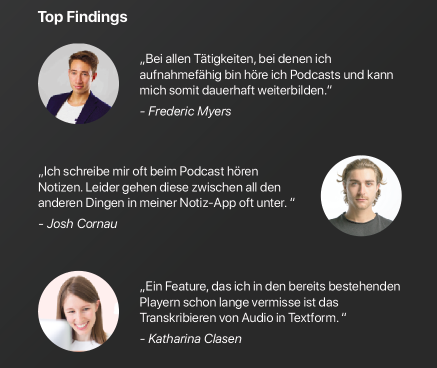
Three of our main insights are quoted on the left picture (german). Here is a short conclusion: Most people listen to podcast while doing some other stuff. Often it's cleaning, driving or doing sports. Some people do take notes while listening in a seperate note app on their phone. But they also told us that they mostly never look at them again because these notes are not seperated and linked to their podcasts. Two of our interviewees wanted to get the transcribed text from the marked position. So when they look at their marks and notes they don't need to listen to this section again, but instantly know what it is about.


UI Iterations
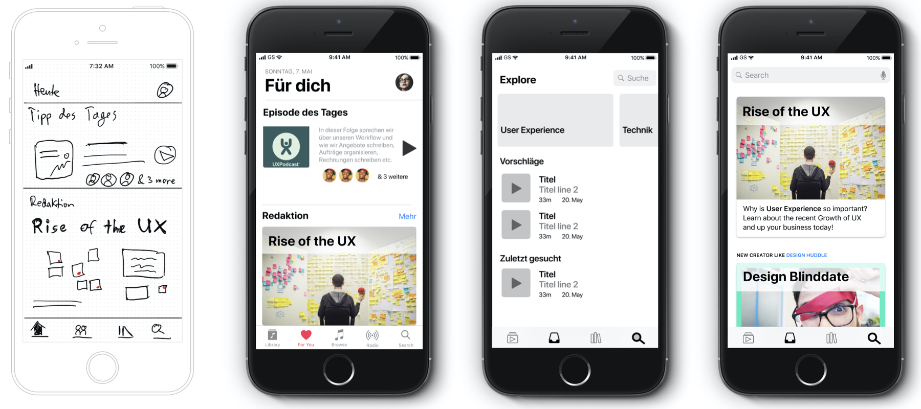
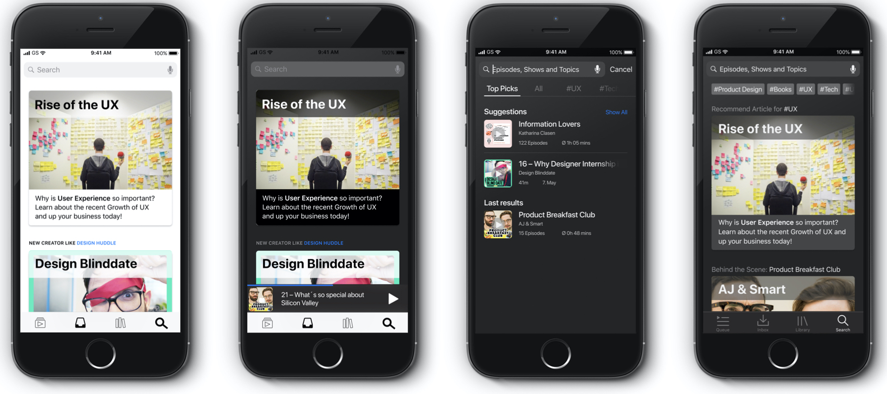
After choosing and prioritising the feature set of our player, we startet with the User Interface. Here we typically go from basic wireframes on paper/ipad drawings over simple copy an paste wireframes in Figma or Sketch to more and more detailed interface design with real data. In the picture above you can see the explore/search tab to showcase our process. In this project we used Figma for the UI Design as it provides the best collaboration of all Design tools at the moment. As our projects are always team-based we needed to be able to work simoultaneously on the UI as well.
Final UI Prototype
In the video on top of this page you can see our final UI for this project. It features a well structured podcast player with four tabs. We focused especially on the Explore and the Mark/Note features. These are things our users wanted and other players don't offer. We hope to inspire some big apps in the podcast business to include a marking feature in the near future.
Supervisor: Prof. Hans Krämer
Partners: Dominik Fink, Robin Deeg
Key Skills: User Research, Concept Ideation, Visual Design