ABOUT COLI
6. Semester / Application Design
How does Coli improve parcel delivery in cities?
Most parcels will be delivered during the main working hours.
For this reason, many parcels cannot be delivered directly.
We minimize this additional time expenditure for deliverers and orderers through our service.
The user can easily have his parcels delivered to an alternative recipient in his area via the app. This can be the neighbour or a kiosk around the corner, with "Coli" parcels will be delivered to these alternative delivery locations and can then be picked up by appointments.
Concept
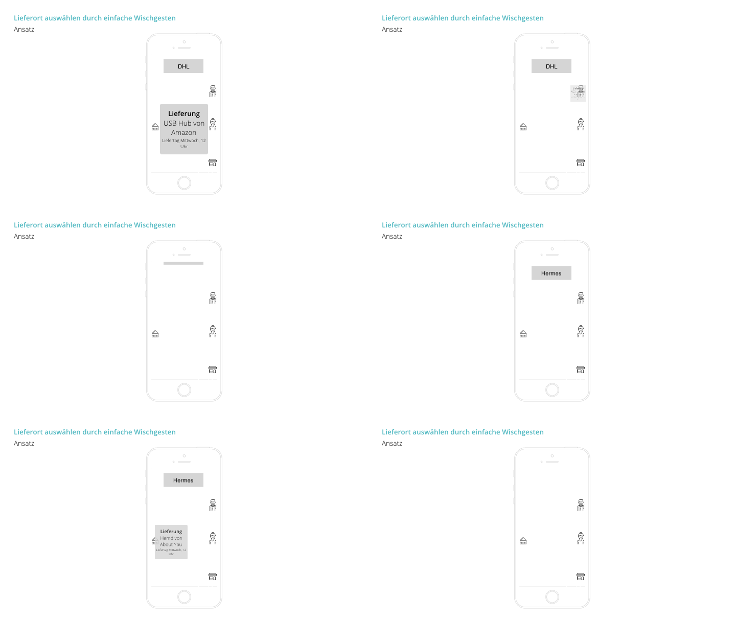
The user can select for every delivery whether he/she is at home at the time of delivery or not. This happens with a "Tinder like" swipe-gesture – This package goes to me, this one to my neighbour, the next to the kiosk and so on. (See GIF)
So if you select "I'm at home" you also get visible for users around you so that they can redirect their packages
(that have the delivery on the same day/time) to you.
User Interface
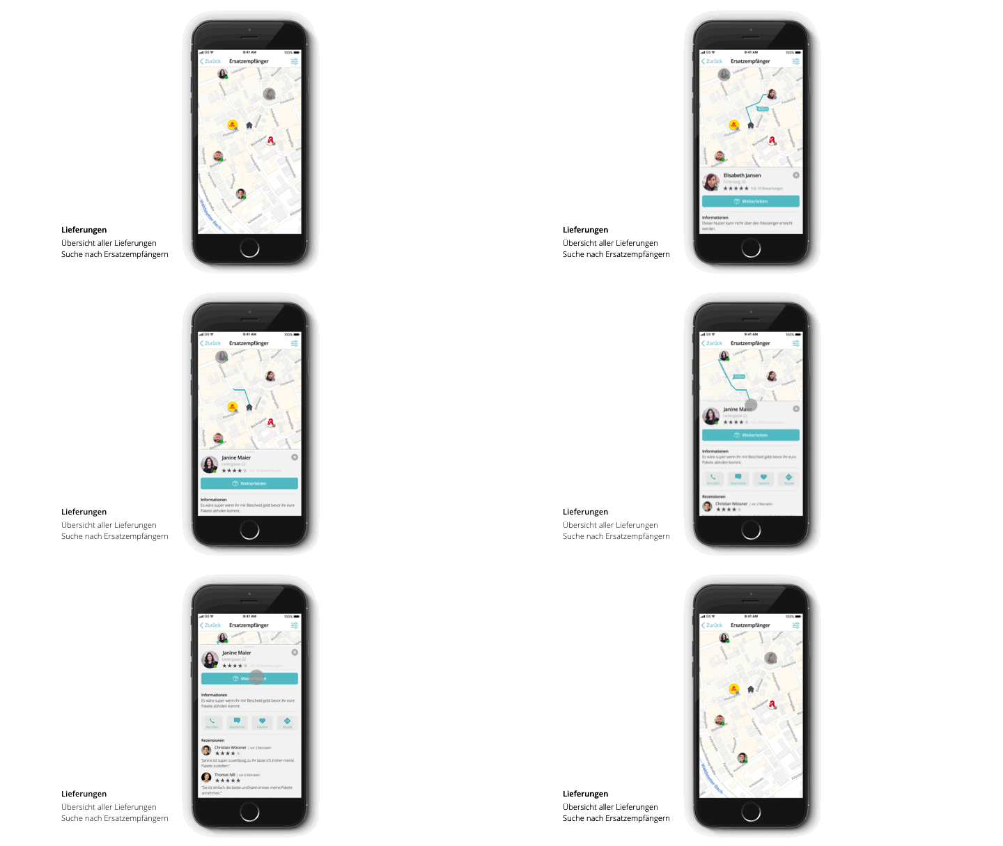
Main screen of the Coli App is the map-view. Here you can redirect your packages to neighbours and stores around you. We found out that the map view is perfect for this, as you can also show how far the other recipients are away from your home. From this screen the user can also see stats, reviews and contact information about the other recipients.
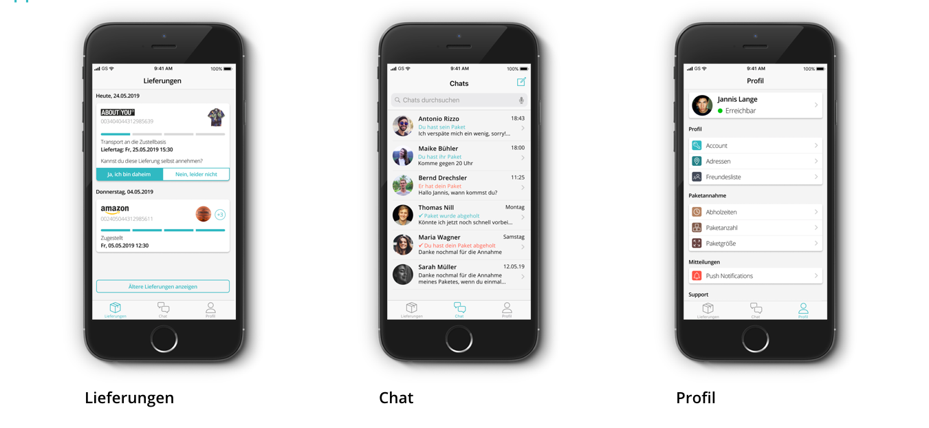
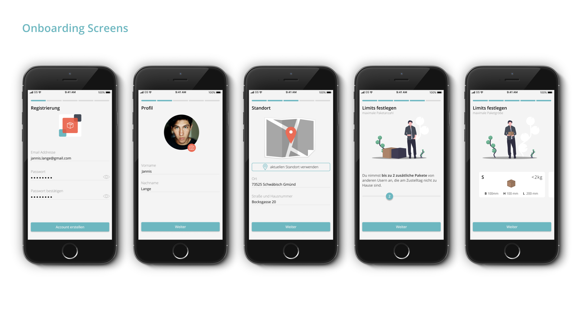
Besides the map-view we also designed the delivery-, chat- and profile-screens. In the delivery tab users can find all their deliveries in a list view. There they can also see and change the status "I'm at home / I'm not at home". The chat can be used to arrange a pick-up of your packages from your neighbour. The profile is used to set different settings like for example, "How many additional packages can be delivered to your home?". These questions are also part of the onboarding process, but it's always possible to adjust these afterwards.
Interface for the postman
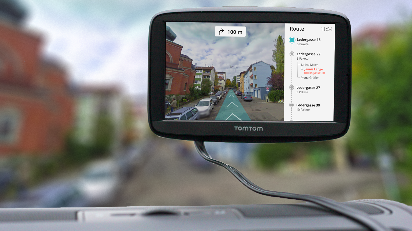
We also designed one example interface screen how the delivery service can see the redirection of packages on their navigation monitor. The driver gets only the adresses of the households on this display where somebody should be at home. Often there can be delivered more than one package because other people selected this person as their alternative delivery option.
Styleguide
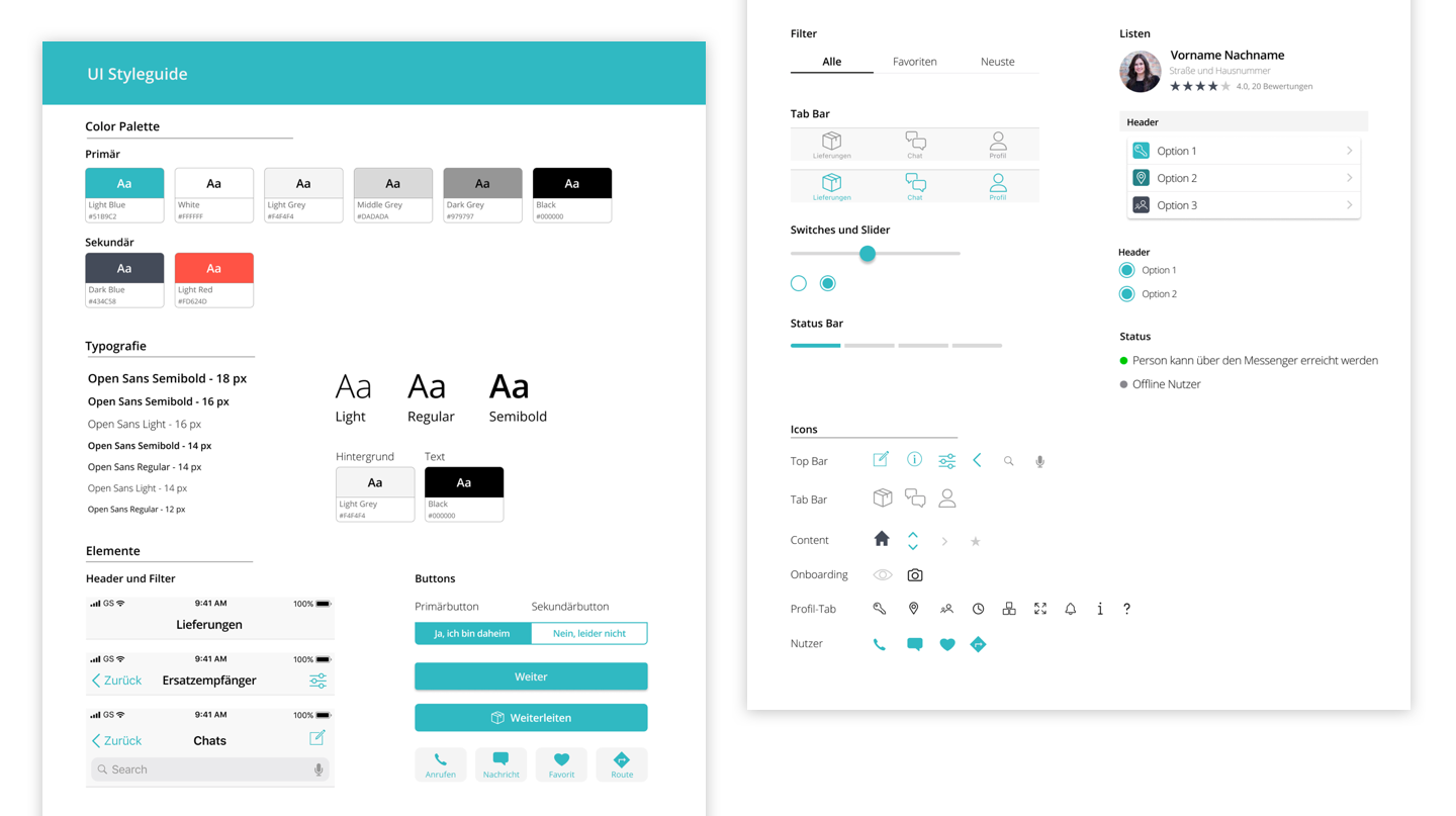
In the styleguide (underneath this text) we collected all interface elements. This helped us to form new elements and screens out of a solid base of styles and elements. We also included all our icons as well as fonts and colours.
Supervisors: Prof. Jens Döring, Prof. Dr. Markus Weinberger
Partners: Dominik Fink, Robin Deeg
Key Skills: User Research, Concept Ideation, Visual Design